A Kraft business card can be a powerful statement—earthy, authentic, and memorable. But they often get a bad rap. Maybe you’ve heard they look unprofessional, that your color options are limited, or that the designs are too simple. Let’s clear that up. When done right, Kraft cards are incredibly versatile. Using modern touches like white ink printing, elegant foil stamping, and custom shapes, you can design a card that feels both sophisticated and genuine. This guide will show you how to move past the myths and use custom kraft business card printing to make your brand truly stand out.
Key Takeaways
- Let the paper reflect your brand: Kraft cards are a strategic choice for communicating an authentic, eco-conscious, and grounded identity. They work best when your brand’s values align with the natural, earthy feel of the paper.
- Design for contrast, not just color: To create a card that gets noticed, work with the paper’s natural brown tone by using dark inks and bold fonts. If you need specific colors, printing a white ink base first will ensure they look vibrant and true to your brand.
- Use customization to signal quality: A Kraft card’s professional feel comes from thoughtful details. Choosing a thicker card stock, a unique shape, or adding a special finish like foil stamping transforms your card into a premium and memorable marketing tool.
What Are Kraft Business Cards, Really?
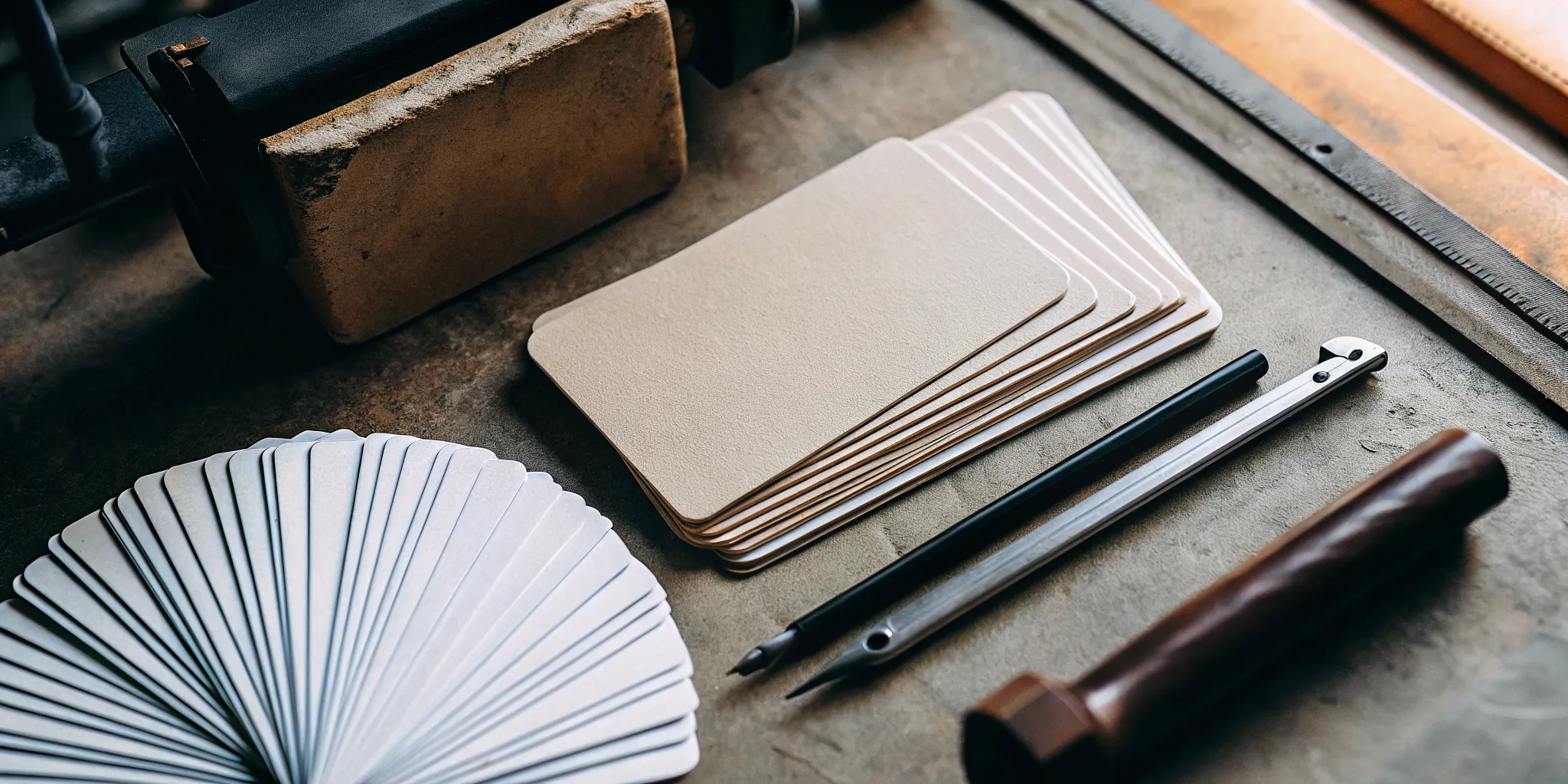
If you’re looking for a business card that feels authentic and makes a quiet statement, Kraft paper might be your perfect match. Kraft business cards are a popular, eco-friendly alternative to traditional cardstock. Made from mostly recycled materials, they have a distinct, natural look that helps your brand stand out. They feel substantial in your hand and immediately communicate a sense of groundedness and quality, showing that your business values both style and substance.
Kraft vs. Standard Cardstock: What’s the Difference?
When you picture a typical business card, you probably imagine a bright white, glossy rectangle. Kraft cards are the complete opposite, and that’s their strength. Instead of a slick coating, they have a matte finish and a natural, slightly textured feel. Their signature light brown color provides a warm, earthy backdrop for your design. We print them on a thick 18pt paper stock, so while they look rustic, they feel sturdy and premium. This unique combination sets them apart from the sea of standard business cards people collect.
The Natural, Eco-Friendly Appeal
One of the biggest draws of Kraft paper is its environmental benefit. These cards are crafted from 90% post-consumer recycled materials, making them an excellent choice for any business that prioritizes sustainability. Choosing Kraft cards is a simple yet powerful way to show your clients and partners what your brand stands for. It demonstrates that you’re thoughtful about your environmental impact, a value that can resonate deeply with today’s conscious consumers. It’s a small detail that speaks volumes about your company’s commitment to being responsible.
Understanding Recycled Content Percentages
So, what does “90% post-consumer recycled” actually mean? It’s simpler than it sounds. “Post-consumer” refers to paper products that have already been used by consumers and then collected for recycling—think old office paper, mail, and cardboard boxes. By using these materials, we give them a second life instead of letting them end up in a landfill. Our Kraft business cards are crafted from 90% post-consumer recycled materials, making them an excellent choice for any business that prioritizes sustainability. This high percentage means your cards are making a tangible difference by reducing waste and conserving natural resources, all while representing your brand beautifully.
From Recycled Start to Recyclable Finish
The eco-friendly story of Kraft paper doesn’t end with its creation. In addition to being made from recycled content, Kraft business cards are also fully recyclable themselves. This creates a closed-loop system where your card can continue its journey long after it has served its purpose. When your clients are done with your card, they can simply toss it in their recycling bin, allowing the paper fibers to be repurposed once again. This dual benefit—a recycled start and a recyclable finish—makes Kraft cards a truly responsible choice, reinforcing your brand’s commitment to the environment from beginning to end.
Their Unique Rustic Look and Feel
The aesthetic of a Kraft business card is truly one-of-a-kind. The natural brown paper and uncoated texture give it a classic, almost handmade appearance that feels both professional and personal. This look is perfect for brands that want to convey authenticity, creativity, and an approachable vibe. The organic feel of a Kraft card is memorable next to glossy, mass-produced materials. It’s a piece of your marketing that feels genuine and helps you build a real connection from the very first introduction.
Embracing Unique Textures and Flecks
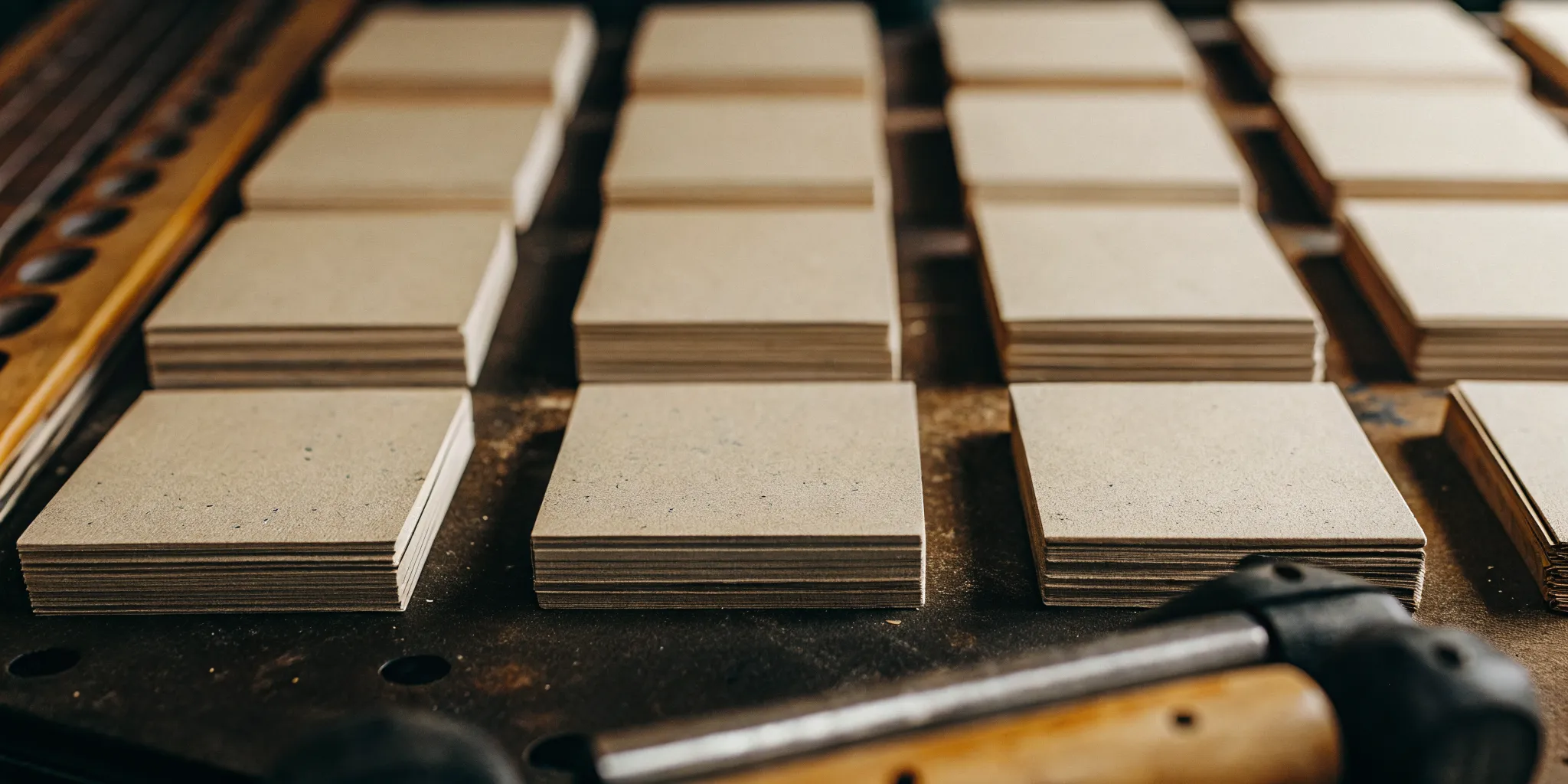
Part of the charm of Kraft paper lies in its beautiful imperfections. Because it’s made from recycled materials, you’ll notice subtle flecks and fibers embedded in the paper, giving each card its own unique character. This isn’t a flaw; it’s a feature that enhances the card’s authentic, handmade feel. The uncoated surface provides a tactile experience that glossy cards just can’t replicate, making your card more memorable to the touch. This texture works wonderfully for brands in creative fields, artisanal goods, or any business that wants to communicate a down-to-earth and genuine personality. It’s a small detail that tells a big story about your brand’s appreciation for authenticity.
Finding Your Perfect Shade of Kraft
While Kraft paper is known for its signature light brown hue, it’s important to know that the exact shade can vary slightly from one batch to the next. This is a natural result of the recycling process and adds to the organic appeal of the final product. At Print It, we use a high-quality 18pt stock for our Kraft business cards to ensure a consistent, premium feel, even with these subtle color variations. This grounded, earthy tone provides a warm and inviting canvas for your design, immediately setting a friendly and approachable tone. Instead of a sterile white, you get a backdrop with personality that helps your brand feel more human and relatable.
Should Your Brand Use Kraft Business Cards?
Kraft paper has a distinct personality, and the big question is whether that personality matches your brand. Choosing a business card isn’t just about printing your contact info; it’s about handing someone a small piece of your brand’s identity. A kraft card sends a clear message of being down-to-earth, eco-conscious, and authentic. For some businesses, this is a perfect match. For others, a more traditional cardstock might tell a better story.
Deciding is all about alignment. Think about the feeling you want customers to have when they hold your card. Does “natural and rustic” fit, or is your brand more “sleek and vibrant”? Answering that question will point you toward the right material. Let’s walk through which brands shine with a kraft card and when you might want to explore other options.
Which Brands Suit a Natural Vibe?
If your brand identity is built around natural products, sustainability, or handcrafted quality, a kraft business card is a fantastic choice. The earthy, textured feel of the paper instantly communicates these values without you having to say a word. Think of businesses like artisanal coffee shops, organic skincare lines, handmade jewelry makers, florists, and farm-to-table restaurants. The card’s recycled composition reinforces an eco-friendly message, which can be a major selling point for customers who prioritize sustainability. These custom business cards help your brand feel approachable, honest, and unique, making a memorable first impression that feels genuine.
When Another Cardstock Might Be Better
On the other hand, kraft paper isn’t a one-size-fits-all solution. If your branding relies on a bright, crisp color palette, you might find that the brown tone of the paper mutes your colors, making them appear darker than intended. Another key consideration is the use of white in your design. Since printers don’t typically print with white ink on kraft paper, any white areas in your design file will simply show the brown paper itself. For brands with a sleek, modern, or corporate aesthetic that requires precise color matching and a clean white background, a traditional cardstock from our other marketing materials might be a better fit to keep your branding sharp and consistent.
How to Make Your Kraft Business Cards Your Own
One of the best things about Kraft paper is how it serves as a beautiful, earthy canvas for your brand. But a blank canvas is just the beginning. Customization is what transforms a simple piece of paper into a memorable introduction. Getting the details right ensures your card not only looks great but also feels substantial and professional in your future customer’s hand. Let’s walk through the key choices you’ll make to create a Kraft business card that truly represents your business.
Start with the Right Size and Shape
While the standard rectangle is a classic for a reason, don’t be afraid to think outside the box, literally. The shape of your card is one of the first things people notice. You can go for a sleek, modern square card or soften your look with rounded corners. Unique shapes like ovals or even custom die-cut designs that reflect your logo can make a huge impact. Think about what your card’s shape says about your brand. A standard shape might say “reliable and traditional,” while a custom shape says “creative and innovative.” Exploring different business card options can spark some great ideas for a design that feels just right.
Select Your Card’s Thickness
The weight of your business card contributes heavily to its perceived quality. A flimsy card can feel cheap, while a thick, sturdy card conveys professionalism and durability. Card thickness is often measured in points (PT), where a higher number means a thicker card. For Kraft paper, you might see options ranging from a flexible 18PT to a more rigid 34PT stock. For an extra premium feel, you can even opt for duplexed or triplexed cards, where two or three layers of paper are fused together. This creates an impressively thick card with a distinct, high-end presence that people will remember.
From Lightweight to Heavy-Duty: Common Thicknesses
Kraft business cards come in a variety of thicknesses, typically measured in points (pt)—the higher the number, the thicker the card. At Print It, our standard Kraft business cards are printed on a sturdy 18pt stock, which provides a great balance of durability and flexibility. This thickness feels substantial in hand, avoiding the flimsy feel that can make a card seem cheap and immediately signaling that you’ve invested in quality. For brands wanting an even more commanding presence, thicker stocks up to 34pt are available, offering a rigidness that feels incredibly premium and ensures your card stands up to being passed around or tucked into a wallet.
Considering Chipboard for an Extra-Thick Feel
If you want to make a truly unforgettable impression, you might consider chipboard. Made from 100% recycled paper, chipboard takes the eco-friendly and sturdy nature of Kraft to a whole new level. These cards can be incredibly thick—sometimes reaching 42pt or more—giving them a commanding weight and presence that instantly feels high-end. Handing someone a chipboard card is a memorable experience; it’s less of a card and more of a keepsake. This option is perfect for luxury brands or any business wanting to communicate unparalleled quality and a commitment to unique materials. It’s a bold choice among many business card options that ensures your card won’t just be seen, but felt and remembered long after the conversation ends.
Consider Special Printing Methods
This is where you can add a “wow” factor that people can see and feel. Special printing techniques create texture and dimension, making your card a tactile experience. You can use embossing to raise your logo or name from the paper’s surface, creating a 3D effect. The opposite of this is debossing, which presses a design into the card for a subtle, indented look. Another popular choice is foil stamping, which applies a thin layer of metallic or colored foil. A touch of gold or silver foil on the rustic Kraft paper creates a stunning contrast that feels both earthy and luxurious. These marketing details show you invest in quality.
The Deal with White Ink on Kraft Paper
Let’s talk about white ink, because it’s a common point of confusion when designing for Kraft paper. With many printers, any white in your design file won’t actually be printed—that area will just be the natural brown of the paper. This is a crucial detail to be aware of, as it can dramatically alter your final design. For a truly professional look, however, you can use a special white ink printing process. This technique prints crisp, opaque white text and graphics that create a beautiful contrast against the brown background. Better yet, you can use that white ink as a base layer. By printing white first and then your brand colors on top, you can make sure they look vibrant and true-to-brand, not muted. This is the key to creating Kraft business cards that feel both high-end and authentic.
Should You Print on One Side or Two?
This decision comes down to how much information you need to share. A single-sided card offers a clean, minimalist aesthetic and leaves the back open for handwritten notes, which can be a nice personal touch. However, printing on both sides doubles your available space. This is your chance to add valuable information without cluttering the front of your card. You can use the back for a list of your services, a map to your storefront, a compelling brand tagline, or a QR code that directs people to your website or portfolio. It’s a practical way to give contacts all the information they need in one place.
Complete the Look with Special Finishes
Beyond the physical shape of the card, special finishes can make your design pop. Since Kraft paper has a natural brown color, printing with white ink is a fantastic way to create sharp, high-contrast designs that stand out. You can also use spot colors, which are specific pre-mixed inks used to match your brand colors perfectly. This ensures your logo looks exactly as it should. Combining these effects with other techniques, like adding a touch of foil, can produce a truly unique card. Reviewing a printer’s full product list can give you a better sense of all the creative combinations available to you.
Checking Finish Compatibility with Your Cardstock
Your choice of finish is where the magic really happens, but Kraft paper’s unique qualities mean you need to be thoughtful about what you pair it with. Not every effect will appear the same as it would on a standard white card. For example, foil stamping is a fantastic option because the shimmer of metallic foil against the matte, brown paper creates a beautiful contrast that feels both high-end and down-to-earth. Techniques that add physical texture, like embossing or debossing, are also great matches because they enhance the paper’s already tactile feel. Since the paper itself is brown, using white ink printing is key for creating crisp, high-contrast designs that pop. Taking a moment to confirm which finishes are compatible with Kraft stock will ensure your final card looks exactly as you imagined: polished, professional, and perfectly on-brand.
How to Design a Kraft Card That Stands Out
Designing for Kraft paper isn’t the same as working with a blank white canvas. The warm, earthy tone of the paper is a core part of your design, not just a background. To create a card that truly stands out, you need to work with the material. A few strategic choices can make the difference between a card that looks muddy and one that feels intentional, professional, and memorable. Here are my go-to tips for designing Kraft cards that get the right kind of attention.
Go for High-Contrast Colors
The natural brown of Kraft paper can absorb light and mute some colors, so contrast is your best friend. Designs with darker colors look best on these cards because they really pop against the light brown background. Think bold black, deep charcoal, forest green, or rich burgundy. These shades create a crisp, readable look that feels both rustic and refined. For an even more striking effect, consider adding white ink. Using special printing techniques can make your logo and text stand out with incredible brightness and clarity, creating a premium feel that’s hard to ignore.
Embrace a Clean and Simple Layout
Kraft paper has a personality all its own, so you don’t need a complicated design to make an impact. In fact, a simple, clean layout often works best. It helps your brand look approachable and unique while letting the card’s texture do some of the talking. Focus on the essentials: your logo, name, and the most important contact information. Generously using white space (or, in this case, “brown space”) prevents the card from feeling cluttered and draws the eye to what matters most. A minimalist approach reinforces the grounded, authentic vibe that makes these custom business cards so appealing in the first place.
How to Find the Perfect Font
Your font choice is crucial for setting the tone and ensuring your card is easy to read. The texture of Kraft paper can sometimes make very thin or intricate fonts difficult to see clearly. Opt for fonts that are clean and have a bit of weight to them. A modern sans-serif font can create a beautiful contrast with the rustic paper, while a classic serif font can lend a timeless, established feel. While script fonts can be lovely for artisanal brands, make sure they are legible and not overly ornate. The goal is to find a font that complements the paper’s natural aesthetic without getting lost in it.
Ensure Your Design Matches Your Brand
A Kraft business card sends a message before anyone even reads the text. Its earthy, organic feel instantly communicates certain values. These cards are a fantastic choice for businesses that care about the environment, creative companies, coffee shops, makers, and small businesses that want a natural and honest feel. If your brand is built on being handmade, sustainable, or rustic, a Kraft card is a perfect match. It acts as a physical representation of your brand’s ethos. Before you commit, ask yourself if this natural aesthetic aligns with your overall brand identity. When the material and the message are in sync, your card becomes a powerful marketing tool.
Kraft Business Card Myths: Let’s Set the Record Straight
Kraft paper has a distinct personality, but it’s also surrounded by a few persistent myths. If you’re on the fence about choosing it for your business cards, let’s clear up some common misconceptions. You might be surprised by how versatile, professional, and vibrant these cards can be when designed thoughtfully.
Myth: Your Design Options Are Limited
One of the biggest misunderstandings about Kraft paper is that it boxes you into a single, rustic look. That couldn’t be further from the truth. Kraft paper is a creative canvas, not a limitation. You can move beyond the standard rectangle and choose from squares, circles, or even custom die-cut shapes that reflect your logo or industry. Special printing techniques like foil stamping, embossing, and debossing also work beautifully on this textured paper, adding a sophisticated and tactile element that makes your card memorable. The right design choices can transform a simple Kraft card into a premium piece of marketing material.
Myth: Colors Look Bad on Kraft Paper
It’s true that the natural brown color of Kraft paper influences how ink appears, but that doesn’t mean your colors won’t look great. You just need to design with the paper in mind. Dark, high-contrast colors like black, deep navy, and forest green look incredibly sharp and striking against the earthy background. If your design relies on bright or light colors, there’s a simple professional solution: printing a layer of white ink underneath your colored design. This base layer acts as a primer, allowing the true colors to pop with vibrancy. This technique ensures your logo and text are crisp and clear, giving you the best of both worlds.
Myth: They Don’t Look Professional
Some people worry that a Kraft card might not look “serious” enough for their business. However, professionalism isn’t one-size-fits-all. It’s about choosing materials that authentically represent your brand’s identity. A Kraft business card sends a powerful message that your brand is grounded, approachable, and environmentally conscious. For businesses in creative fields, artisanal goods, or wellness, a Kraft card often feels more appropriate and genuine than a traditional glossy one. It’s a strategic choice that communicates your values and helps you connect with a like-minded audience, leaving a unique and lasting impression.
Myth: They’re Always More Expensive
Many assume that because Kraft cards are a specialty item, they must come with a higher price tag. In reality, they are often a very cost-effective option. The final price of any business card order depends more on factors like card thickness, quantity, and special finishes than the paper stock itself. A clean, simple Kraft card can be quite budget-friendly. While adding features like foil or custom shapes will increase the cost, the base paper is competitively priced. Plus, like with any print job, ordering in larger quantities significantly reduces the cost per card, making it an accessible choice for businesses of all sizes.
Mistakes to Avoid When Ordering Kraft Cards
Getting your Kraft business cards just right is totally achievable, but there are a few common pitfalls to watch out for. The unique nature of the paper means that what works for a standard white card might not translate perfectly. Thinking through your design, card thickness, and color choices ahead of time will save you from any surprises and ensure you get a final product you absolutely love. Let’s walk through the three biggest mistakes I see people make so you can sidestep them with ease.
Avoiding an Overly Complex Design
With Kraft paper, less is truly more. The beautiful, rustic texture of the card is a feature in itself, and the best designs let it shine. A cluttered layout with too many elements can look busy and overwhelm the natural aesthetic. Instead, focus on a clean, simple approach. High-contrast designs, like bold black text or a minimalist logo, really stand out against the light brown background. When you’re creating your layout, prioritize your most important information and embrace negative space. This will make your business cards feel confident and easy to read, not crowded.
Picking the Wrong Card Thickness
The thickness of your business card, often measured in points (PT), says a lot about your brand before anyone reads a single word. A flimsy card can feel forgettable, while a thick, sturdy one conveys quality and permanence. When ordering Kraft cards, you’ll often see options ranging from a more flexible stock to a much more rigid one. Think about how you want your brand to feel in someone’s hand. A thicker card is great for making a premium impression, while a thinner, more standard weight can be a practical choice for orders with a high quantity. Your choice should align with your brand’s personality and how your cards will be used.
Forgetting How Paper Color Affects Your Design
This is a big one. Unlike bright white cardstock, the natural brown color of Kraft paper will influence how your ink colors appear. Lighter colors can look muted or darker than they do on your screen because the paper’s tone shows through. This can create a wonderful, earthy vibe if that’s your goal. However, if you need your logo or text to be vibrant and true to your brand palette, you have a great option: printing with white ink. We can lay down a layer of white ink first and then print your colors on top of it. This makes your design pop and ensures your marketing materials look exactly as you intended.
Prepping Your Files for Perfect Printing
Getting your design from the screen to the final printed card requires a bit of technical prep. Taking a few minutes to set up your digital file correctly ensures your Kraft business cards look exactly as you imagined them, with no surprise cropping or blurry text. It’s the single best thing you can do to guarantee a smooth printing process and a professional result. Let’s walk through the three key areas to check before you send your design to print.
Getting the File Format and Resolution Right
To make sure your design prints clearly, you need to save it in the right format and at the right resolution. For professional printing, the best file formats are PDF, TIFF, or EPS because they preserve the quality of your design elements. When you save your file, you’ll also want to check the resolution, which is measured in DPI (dots per inch). A higher DPI means a sharper image.
For a crisp, clear business card, your file should have a resolution of at least 300 DPI. Anything lower can result in a final product that looks pixelated or blurry. Most design software has a straightforward process for setting the resolution when you create or export your file, so it’s an easy box to tick for a high-quality finish.
How to Set Up Your Bleed and Safe Zones
Have you ever seen a printed item with an awkward white sliver along the edge? That’s what happens when a file isn’t set up with a bleed. A bleed is a small margin of your design that extends beyond the card’s final trim line. By adding a standard 1/8-inch (0.125 inches) bleed on all sides, you give the printer some wiggle room for cutting, ensuring your background color or image goes right to the very edge.
Similarly, you need a safe zone. This is an area inside the trim line, also typically 1/8-inch, where you should keep all your important text and logos. This prevents anything critical from getting accidentally trimmed off during production. Think of it as a safety buffer for your most important information.
Choosing the Right Color Mode for Kraft
The color you see on your screen doesn’t always translate directly to paper, especially with a unique material like Kraft. Your computer monitor uses an RGB (Red, Green, Blue) color model, but professional printers use CMYK (Cyan, Magenta, Yellow, Black). Always set your design file to CMYK for the most accurate color results.
With Kraft paper, you also have to account for the natural brown background. Light colors can look muted or get lost, while white won’t print at all unless you opt for a special white ink process. For the best results, stick with dark, bold, high-contrast colors like black, deep blues, or rich greens. These colors stand out beautifully against the earthy tone of the paper, creating a striking look for your custom business cards.
How Much Do Custom Kraft Business Cards Cost?
One of the first questions I get about Kraft business cards is about the price. The short answer is: it depends. Unlike standard, off-the-shelf options, the cost of a custom card isn’t a flat rate because every order is unique. Think of it less like buying a product and more like commissioning a small piece of art that perfectly represents your brand. The final price is a direct reflection of your creative choices, from the quantity you order and the thickness of the paper to the special finishes you add.
This flexibility is actually one of the biggest advantages of custom printing. It puts you in the driver’s seat, allowing you to create a card that fits your specific budget without compromising on a professional look. Whether you’re a startup looking for an affordable but memorable option or an established brand ready to invest in high-end features like foil stamping, you can tailor the final product to your needs. We offer a wide range of business cards to ensure you find the perfect match for your financial and branding goals. To give you a clearer picture of how it all adds up, let’s break down the main factors that influence the final cost of your order.
What Factors Influence the Cost?
The final price of your Kraft business cards is shaped by the specific features you select. The most significant factor is quantity; ordering more cards at once will lower your cost per card. Beyond that, the thickness of the paper, whether you print on one or both sides, and the complexity of your printing method all play a part. For instance, a design that uses full-color offset printing will be priced differently than one using only black ink. Any special customizations will also adjust the total. Features like rounded corners or foil stamping add a unique touch, but they also add to the production cost. These details are what make your marketing materials stand out.
What to Expect: Sample Starting Prices
To give you a concrete idea, a basic order of 250 standard-sized, 18PT Kraft business cards with a simple one-sided black ink design can be very affordable. This is often a pleasant surprise for people who assume “specialty paper” means a high price. This starting point gives you a high-quality, memorable card without a big investment. From there, the price will adjust based on your choices. Opting for a thicker card, printing on both sides, or adding a special finish like white ink will increase the cost. The best way to know for sure is to explore the options for our Kraft business cards and see how these different features affect the final price for your unique design.
How Bulk Orders Can Save You Money
If you want to get the best value, consider placing a bulk order. The price per card drops significantly when you order larger quantities. While a set of 250 cards is great for getting started, moving up to 500, 1,000, or more can lead to substantial savings in the long run. This is an excellent strategy for businesses that are active at trade shows, have multiple employees, or simply hand out cards frequently. Think about your annual needs. If you anticipate needing a steady supply of cards throughout the year, placing one large order is more cost-effective than several small ones.
How to Order Kraft Cards on a Budget
Creating beautiful Kraft business cards doesn’t have to break the bank. A few strategic choices can help you manage costs while still getting a high-quality product. First, plan ahead. Placing your order well before you need it helps you avoid any rush fees associated with tight deadlines. Second, consider a simpler design. A clean, minimalist layout with high-contrast ink often makes the biggest impact on Kraft paper and is typically more affordable than a multi-color design. Finally, order a quantity that makes sense for your business. Take a moment to explore the entire product list to compare options and find the sweet spot between quantity and price that works for you. And my most important tip: proofread everything twice. Catching a typo before printing saves you the cost and headache of a reprint.
Look for Discounts and Shipping Offers
Here’s a little pro tip: always take a quick look for special promotions before you finalize your order. It’s common in the printing world to find deals that can make your budget go a little further. You might find a discount code for 10% or 20% off your purchase, or an offer for free shipping on orders over a certain amount, like $100. These savings can really add up, especially if you’re placing a larger order. While a great deal is always a bonus, make sure you’re also getting consistent quality and service. The goal is to get beautiful custom business cards you’re excited to hand out, without any surprises.
Choosing the Right Printer for Your Kraft Cards
Choosing a printer is about finding a partner who can bring your vision to life. The right company will not only deliver a beautiful final product but also make the process smooth and straightforward. When you’re ready to print your Kraft business cards, here are four key things to look for in a printing partner.
Look for High-Quality Materials
The foundation of a memorable business card is the paper it’s printed on. For Kraft cards, you want a printer that uses a sturdy, high-quality stock that feels substantial in your customer’s hand. Many Kraft papers are made from recycled materials, which gives them their signature texture and eco-friendly appeal. Beyond the paper itself, pay attention to the print quality. A great printer will know exactly how to make colors pop and text look sharp against the natural brown background, ensuring your design is clear, vibrant, and professional.
A Wide Range of Custom Options
Your business card should be as unique as your brand, and a good printer will provide the tools to make that happen. Look for a company that offers a wide range of customization options beyond basic printing. Can you choose from different shapes, like square or mini cards? Do they offer special techniques like foil stamping to add a touch of shine, or embossing to create a raised, tactile effect? The more choices you have, the more you can tailor your card to perfectly match your brand’s style and stand out from the competition.
Check for Reliable Turnaround Times
There’s nothing worse than ordering materials for a big event, only to have them arrive a day late. A trustworthy printer is always transparent about their production schedule. Before you place an order, check their estimated turnaround times and make sure they align with your deadline. Many printers will clearly state how many business days production takes after you approve the final design. If you’re in a hurry, see if they offer rush services. A reliable partner understands that timing is everything and will work with you to get your cards delivered when you need them.
Exploring Expedited and Same-Day Printing Options
We’ve all had that moment of panic: a last-minute conference is added to your schedule, or you realize you’re almost out of cards right before a big client meeting. This is where expedited printing options become a lifesaver. A great printing partner understands that sometimes you need things fast, and they’ll offer rush services to meet your tight deadline. The key is to ensure that speed doesn’t come at the expense of quality. Even with a quick turnaround, your Kraft cards should still have sharp, clear text and rich, high-contrast colors. A reliable printer will maintain their quality standards no matter the timeline, ensuring you can still get the perfect custom business cards for your event. While planning ahead is always the best way to avoid rush fees, it’s good to know you have a partner who can deliver when you’re in a pinch.
Demand Clear and Transparent Pricing
You should know exactly what you’re paying for before you commit. Look for a printer with a clear and straightforward pricing structure. It should be easy to see how different choices, like adding a special finish or selecting a thicker cardstock, affect the final cost. Many online printers have a built-in calculator that updates the price as you select your features. This transparency helps you manage your budget effectively and avoid any surprise fees. If your order is complex, a good printer will also make it simple to request a custom quote for your specific needs.
Ready to Create Your Kraft Business Cards?
If you’ve decided that the natural, earthy feel of Kraft paper is the right fit for your brand, the next step is bringing your vision to life. Creating a business card that feels authentic and looks professional is a straightforward process. We’re here to help you design a card that not only shares your contact information but also communicates your brand’s unique story and values from the very first handshake.
Here’s Why Businesses Choose Us
If you’re looking for a business card that feels authentic and down-to-earth, Kraft paper is a fantastic choice. Businesses choose this material because it sends a clear message. The natural, rustic texture gives a genuine impression, making it perfect for brands that value honesty and craftsmanship. Think coffee shops, handmade artisans, eco-conscious companies, and any small business that wants to stand out with a classic, organic feel. Plus, our Kraft cards are made from recycled materials, so you can feel good about making an environmentally friendly choice. We’re here to help you create business cards that not only share your contact info but also tell a story about your brand’s values.
How to Place Your Order Today
Getting your custom Kraft cards is a simple and creative process. If you have a design ready to go, you can upload it directly. If you need some help, our online tools and templates make it easy to bring your vision to life. From there, you can make your cards truly your own. We offer a variety of sizes and shapes, from standard rectangles to unique squares or cards with rounded corners. You can also add special printing techniques like foil stamping or embossing to make certain elements pop. Our goal is to give you all the options you need to design a card that perfectly represents your business. You can explore our full product list to see all the ways we can help your brand shine.
Related Articles
- Kraft Business Cards – Print It
- Easily Upload Designs for Your Kraft Business Cards
- Business Cards
- Business Card
- Business Card
Frequently Asked Questions
Will my brand colors look strange or faded on the brown Kraft paper? This is a great question because it shows you’re thinking like a designer. Darker, high-contrast colors like black, charcoal, or deep navy look incredibly sharp on their own. If your brand uses bright or light colors, we have a perfect solution. We can print a layer of white ink underneath your design, which acts as a primer and allows your true brand colors to look vibrant and accurate.
Are Kraft cards as durable as traditional business cards? Absolutely. Don’t let the “recycled” description fool you into thinking they’re flimsy. We print our Kraft cards on a thick 18pt stock, which feels substantial and professional in your hand. You can even choose thicker options for an extra premium feel. These cards are designed to withstand being passed around and tucked into wallets, just like any high-quality traditional card.
You mention keeping the design simple. How do I do that without my card looking boring? Simplicity doesn’t have to mean boring; it often means confident. A clean design on Kraft paper looks intentional and high-end. To add personality without clutter, focus on one or two key elements. You could use a bold, interesting font for your name, add a touch of metallic foil to your logo, or use an embossed effect to create a texture people can feel. These special touches make a minimalist design feel incredibly luxe.
Do I really need to use white ink? What’s the point? You don’t always need it, but it’s a fantastic tool for making your design pop. Since printers don’t use white ink by default, any white in your design file will just show the brown paper. If you want actual white elements, like white text or a white background for your logo, you need to select the white ink option. It creates a stunning contrast and is the key to achieving a bright, crisp look on the earthy paper.
My business isn’t ‘rustic’ or ‘handmade.’ Can Kraft cards still work for me? Yes, they definitely can. While Kraft paper is a natural fit for artisanal brands, its versatility might surprise you. When paired with a sleek, modern font and a minimalist layout, a Kraft card can project a very chic and eco-conscious image. Adding a touch of gold or silver foil can create a look that feels both earthy and luxurious. It’s all about how you style it to tell your unique brand story.